Dashboard For Employees Survey
Project Description
Stack: CSV · Power Query · Power BI
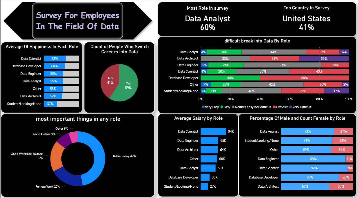
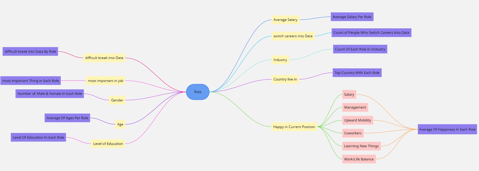
This project analyzes survey data from employees working in the field of data. A Mind Map was first created to identify the key questions (e.g., salary, happiness, gender balance, education, role challenges). The raw CSV survey dataset was then cleaned, transformed, and modeled using Power Query, followed by designing a Power BI dashboard to present clear and interactive insights.
What the dashboard shows
• Most common role in the survey: Data Analyst (60%).
• Top country represented: United States (41%).
• Average happiness levels by role (highest: Data Scientist 62%, lowest: Student/Looking 37%).
• Average salary by role (highest: Data Scientist ≈94K, lowest: Student/Looking ≈27K).
• Count of people who switched careers into data (59%).
• Distribution of gender per role (e.g., Data Scientist: 92% male, 8% female).
• Most important factors employees value in their roles: Better Salary (47%), Remote Work (20%), Work-Life Balance (19%).
• Difficulty of breaking into data roles, visualized across job categories.
Outcome & value
The dashboard highlights the main challenges, expectations, and demographics of professionals in data-related careers. By combining structured survey responses with interactive visualizations, the project uncovers insights such as the salary gap, career satisfaction levels, and role accessibility. This allows HR teams, managers, and aspiring data professionals to better understand trends, benchmark career progress, and design strategies for talent development in the data industry.
Project Screenshots
📌Row Data File
📌 Mind Map Screenshot

📌 Dashboard Screenshot